The prose is the most important element—everything else is complementary.

The purpose of book design is not to make pages beautiful. It is to make the prose beautiful to read.
 Most conversations begin one step too late: which font, how much margin, what goes on the cover. Those considerations are downstream of a prior one that almost nobody asks first. What is the page for? Until that question is answered, every typographic decision is a guess.
Two Philosophies
The first treats the book as a display piece. Every page should impress. Chapter openings and illustrations should compete for the eye. Typography becomes one more dazzling element to be sold to a reader. The design becomes the performer, and the prose waits in the wings.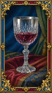
The second treats the book as an instrument. Beatrice Warde described this philosophy in her 1930 essay The Crystal Goblet, where she argued that fine printing should function like a clear wine glass rather than a jeweled, colored one: the vessel exists to let you see the wine, not to be admired instead of it. Margins create silence. Leading produces rhythm. Type brings clarity. Illustration establishes atmosphere and then withdraws. Nothing exists for its own sake, only so the prose can sing.
I design toward the second philosophy, though the first one is winning everywhere else. Covers compete as thumbnails on a storefront grid. Social feeds reward whatever is loudest in the first half second. That pressure has crept into interiors too. Pages are conceived as posters, every part demanding the same focus, none of it in service of the sentence underneath. It can work for certain genres. For historical fiction, where the aim is to place a reader in another time, it moves against that goal.
The Hierarchy of Attention
Before I wrote novels, I spent years in graphic design and advertising. One lesson that matters more for books than anything I learned about typesetting is that if every element shouts, nothing is heard. Good advertising is built on a sequence the eye is meant to follow, one thing handing attention to the next.
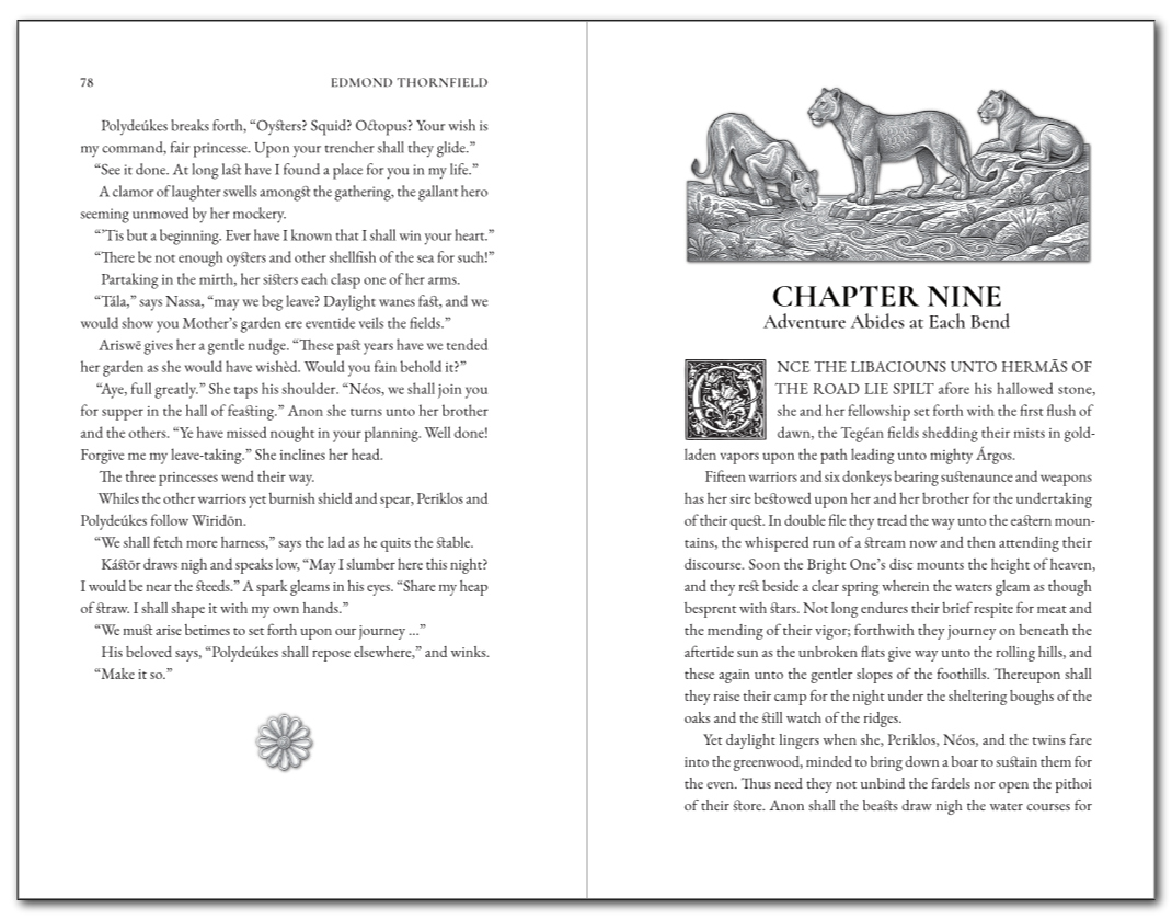
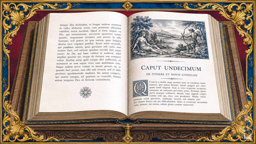
A chapter opening in one of my novels follows that sequence. Take Chapter Nine of Atalanta of the Wild. The reader’s eye lands first on an engraved Illustration, three lionesses at rest by a stream, rendered in monochrome with generous white space around them. Because the 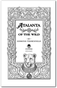 image is quiet rather than ornamental, the eye does not linger. It moves down to the chapter title, then to the subtitle beneath it, and on to the drop cap that opens the first sentence. By the time the prose begins, the Illustration has finished its job. Nobody reads the fourth paragraph thinking about the lionesses, and that is not a failure of the artwork. It is the measure of its success.
The same logic governs the decorated title page. The frame, antlers, lioness, and symbol of my own imprint: all scene-setting, a doorway rather than a destination. Once the reader is through, the door should close behind them.
Historical Precedent
The finest illustrated books worked this way. The Kelmscott Press editions William Morris produced in the 1890s paired dense ornament with respect for the text block beneath it. 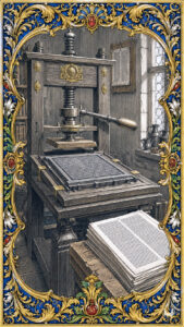 The Ashendene Press held to the same restraint a generation later. Aldus Manutius, in Venice at the turn of the sixteenth century, is often credited with inventing italic type and the pocket-sized book for this reason: to get more reading into a reader’s hands with less friction between the eye and the sentence. Even Gustave Doré, whose nineteenth-century engravings are as dramatic as Illustration gets, placed them at chapter breaks and left the running text alone.
 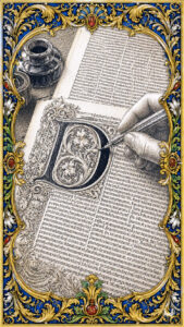 The picture does not narrate alongside the prose or compete with it.
What these traditions share is a belief that a book is a single artistic object, not a text with decorations attached to it. In my experience, such unity does not come from assigning the typography to one specialist, the Illustration to another, and the layout to a third. It comes from one person caring about the whole: the drop cap has to agree with the chapter ornament, the ornament has to suit the register of the prose, and all three must belong to the book itself.
The Cathedral
Nobody enters to admire the mortar between the stones. If it is bad, the building falls down and the experience is ruined; if it is good, nobody notices it. They see the light coming through the windows and the 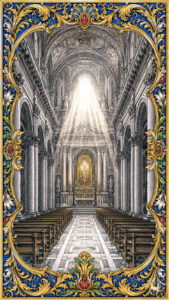 height of the nave. They hear the silence. Good architecture builds a space in which something larger than the structure can happen.
Books work the same way. The margins, the leading, the tracking, the placement of a drop cap, none of it is meant to be seen. It is felt in its absence, in the small friction a reader experiences without knowing why when a page has been composed to be looked at rather than read. A reader will seldom tell you the leading was generous or the margins were considered. They will say, “it was a pleasure to read.” For five centuries, that remains the highest compliment the craft of typesetting can earn.
A Different Question
Most design advice today circles the same question: how do I make this look expensive? That is the wrong one to ask first. The better approach is harder to define:  how do I make this effortless to read?
Those two aims are not the same project. One pursues ornament. The other pursues the discipline of craft, measured by what a reader never has to think about. A page can look expensive and still fight the reader on every line; a plain layout can be the reason someone finishes a four-hundred-page novel in a weekend because nothing in it got between them and the sentence.
The prose is the governing element. Everything else supports it. Once that ordering is settled, each decision—the font, the drop cap, the ornament, the Illustration, the white space around all of it—has a single test to pass: does it serve the sentence or ask the reader to serve it instead? Design the book so the question never has to be asked.
Rio de Janeiro, the xxiii day of July, MMXXVI.

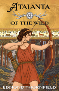
Click the cover to read a preview chapter and learn more.
Further Reading:
- Beatrice Warde, The Crystal Goblet: Sixteen Essays on Typography (1955)
- William Morris, The Ideal Book: Essays on Lectures on the Arts of the Book (University of California Press, 2023. Original lecture delivered and published in Transactions of the Bibliographical Society, Volume I, 1893.)
- Stanley Morison, First Principles of Typography (1936)
- Martin Lowry, The World of Aldus Manutius: Business and Scholarship in Renaissance Venice (1979)
Related Essays: