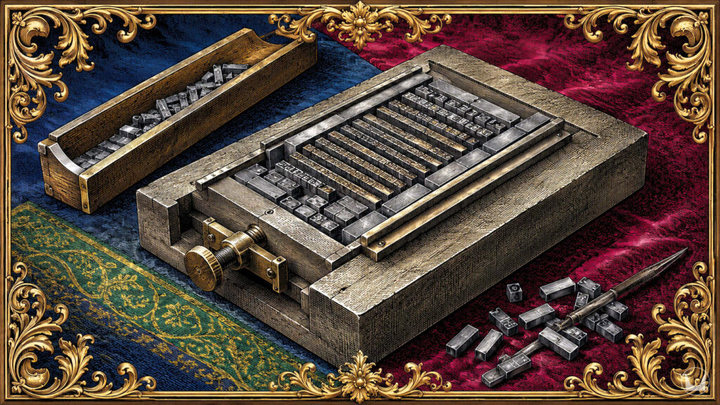
 Before I ever touched a computer, I touched lead.
I was a child in Brazil in the 1970s and 80s, and I remember the weight of a form in my hands, the steel frame holding rows of metal letters and the thin strips of lead spacers that gave a line its breathing room. The compositors in the newspaper printshop taught me typography. I learned it the way a mason learns stone, by carrying it and feeling how much a line of type weighs when it is made of metal. Leading is not an abstract word to me.
Before Scalable Fonts
 By 1990, as an IT and mainframe technician at San Dimas Community Hospital, I was supporting users of Aldus PageMaker, Adobe Photoshop, Illustrator, and CorelDraw. People assume desktop publishing arrived and solved everything overnight. It did not. Scalable fonts were nothing like what we take for granted today. If a job called for a headline at a size the foundry had not shipped, you generated that size, often overnight, and hoped the bitmap held its sharpness when it hit film. Color was not a slider either. A print job went out to calibrated plates, and if the calibration was off by a hair, it ruined the whole run. There was no undo button on a plate.
I carried that way of working into a business. From 1996 to 2006 I owned an advertising agency in Rancho Cucamonga, California, specializing in high-end print production, graphic design, and copy and line editing. Clients came to me because a print job has no tolerance for guessing. A font substitution nobody caught, a miscalculated bleed, an approved color proof with errors: any of these could cost a client an entire run. You learn precision when the alternative is a warehouse of unusable paper.
What an Apprenticeship Teaches
None of this is a story about nostalgia for hot metal or dial-up modems. It is a case for what an apprenticeship gives a person, which is not a set of memorized rules but a body  of judgment built from repeated decisions made under practical constraints.
Book design for print is still that kind of trade. There is no fixed leading value that suits every book, no single correct point size for running text. The right specification depends on trim size, paper stock, genre expectation, printer tolerance, and a dozen other variables that only reveal themselves once the job is in front of you. A professional designer does not consult a chart for these answers. He reads the job and knows, the way a mason understands how a stone will behave under a chisel before the chisel touches it.
This kind of knowing does not arrive in a week, a month, or a year of tutorials. It comes from apprenticeship in the old sense, time served, mistakes made on real material, judgment sharpened against tangible consequence. I do not think this can be replicated by an algorithm, however capable it is at producing a technically correct margin for a given trim size. A tool can tell you what has succeeded. It cannot determine, from the accumulated memory of having ruined paper over it, what the book at hand requires.
An Argument for Staying in Your Lane
I tell authors without a design background to delegate their book design to a professional rather than attempt it themselves. Not because the software and tools are  inaccessible, but because they were never the difficult part. The challenge was always the years spent learning what they cannot tell you.
Having spent decades earning the right to trust my eye on a page, I typeset my own novels. This is not a credential I would advise a novelist to try to acquire on the side. Write the book and pass it on.
Rio de Janeiro, the xxiv day of July, MMXXVI.

Further Reading:
- Daniel Berkeley Updike, Printing Types: Their History, Forms, and Use (1922)
- Robert Bringhurst, The Elements of Typographic Style (1992)
- Simon Garfield, Just My Type: A Book About Fonts (2010)

Related Essays:
- How To Design Your Book
- Book Aesthetic | ETHORN’s Literary Universe
(Pinterest board companion essays) - Archaic English & Literary Style (further craft notes)