William Morris believed the book as physical object was itself a work of art, that typography, layout, and illustration were not secondary to the text but coequal with it. I agree with him. Unconditionally.
This is not a fashionable position. The publishing industry has spent decades treating book design as a downstream function. It is something that happens to a manuscript after the real work is done, delegated to art departments working under budget constraints and schedule pressure, optimized for production efficiency rather than aesthetic integrity. The result is a vast literature clothed in interchangeable garments. The words may be extraordinary; the vessel that carries them is often not.
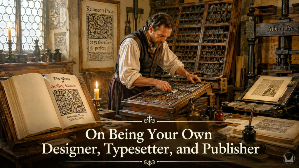
I have chosen a different path. Every book that goes out under my imprint, ETHORN Publishing, is designed, typeset, and produced entirely by me. Every decision, from the cover illustration to the kerning of individual character pairs, is mine. This essay is an account of how that came to be and why I would not have it otherwise.
 The Cover: Where Immersion Begins
I first opened Adobe Illustrator for Windows in 1989. Adobe Photoshop followed in 1992. These were not casual introductions. By 1996, when I founded my first advertising agency, I was producing high-end logos, graphics, and illustrations for clients across aerospace, hospitality, financial services, and other industries. Cover design, when I eventually turned to it for my own novels, felt entirely natural—like walking and breathing, as I describe it. It was simply the application of decades of visual thinking to a new kind of commission.
But there is a discipline specific to the literary cover that has nothing to do with commercial graphic design. A book cover must do something a corporate logo need not. It must tell the truth about what is inside. Not the marketing truth, not the genre-signaling truth, but the deeper truth: the atmosphere, the moral weight, the historical world the reader is about to enter. I make certain that my covers earn that trust. Every visual element is chosen in deliberate conversation with the novel it represents.
For a reader who picks up one of my books, immersion into the past does not begin on page one. It begins the moment they see the cover.
The Typeface: A Commitment to Garamond
From the earliest years of my career as a graphic designer, I have favored the Garamond family. This is not nostalgia or habit. Garamond typefaces carry in their letterforms the memory of the Renaissance printing houses that first cut them: the warmth of metal type, the slight 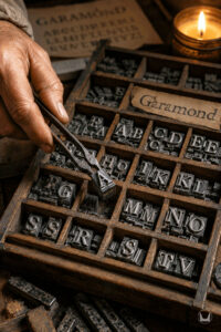 organic variation of letterforms pressed into handmade paper, the eye’s ease across a long page of dense text. They are the correct faces for books about the ancient world and the Renaissance because they are, themselves, artifacts of that transition from manuscript to print.
For my historical novels, I use EB Garamond for the body text and Cormorant Garamond for headlines and special elements. Both are available under open licensing through Google Fonts, which matters for authors publishing digitally and in print without the budget of a major house. For the drop caps that open each chapter, I hold a commercial license for Cloister Initials, designed by Frederic W. Goudy (1865–1947), purchased through MyFonts. Goudy was himself a disciple of the Morris tradition, a type designer who believed that a beautiful letterform was a moral as well as an aesthetic achievement.
In matters of typeface selection, less is always more. Two faces used with precision and intention will always outperform five faces deployed without discipline.
The Typesetting: Character by Character, Line by Line
I began typesetting with Aldus PageMaker 4.0 for Windows around 1990. A colleague at San Dimas Community Hospital, Sue Armstrong, introduced me to it. But the deeper education came later, through Mary Murphy, a gifted desktop publishing professional in Rancho Cucamonga who taught me the craft properly: tracking, kerning, ideal leading, widow and orphan control, line justification, hyphenation guidelines, margins, gutters, page grid. These are not technicalities. They are the grammar of the visual page. A typesetter who does not understand them is producing text; one who does is producing reading.
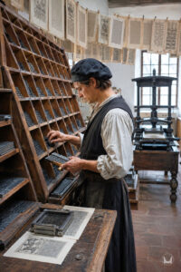 For my own novels and those I format for clients, I typeset character by character, line by line. This is not an efficiency I am willing to sacrifice. The difference between a professionally typeset page and one assembled by default settings is not dramatic; it is cumulative and pervasive. The reader does not consciously notice good typography. They feel it as ease, as pleasure, as the sensation of being in capable hands. They notice bad typography when they can’t quite settle into a book and don’t know why.
My pages are designed to be invisible in precisely that way: so finely tuned that the reader slips through them without friction.
The Book as Total Object
When all these elements combine—cover, typeface, typesetting, chapter header illustrations, decorated title page, colophon, copyright page rendered in archaic form—something happens that no individual element could produce alone. The book becomes a coherent world before the narrative begins.
My title pages are old-fashioned and decorated in the manner of the printing houses Morris admired. My colophon pages carry the devices and inscriptions of a publisher who takes the physical book seriously as an artifact. The chapter header illustrations, the ornamental devices, the closing marks: everything is curated by  Edmond Thornfield, my Renaissance alter ego, who approaches each book as though it were being produced by a craftsman for a discerning patron rather than manufactured for a mass market.
The satisfaction this gives me is difficult to convey to someone who has not felt it. It is the satisfaction of complete accountability. No element of these books exists that I did not choose, approve, and execute. If a page is beautiful, it is because I made it so. If a cover stops a browser in a digital storefront, it is because I designed it to. The work is entirely mine, and the reader who holds one of my books holds the full expression of a single creative vision, unmediated by committees, compromised by no external agenda.
For the moment, I publish under my own imprint. If traditional publishing ever enters the picture, I do not yet know whether I will relinquish this control. I will burn that bridge after I cross it.
The Three Novels and What They Required
Each of my novels has demanded its own visual logic, and meeting that demand has been one of the quiet pleasures of this work.
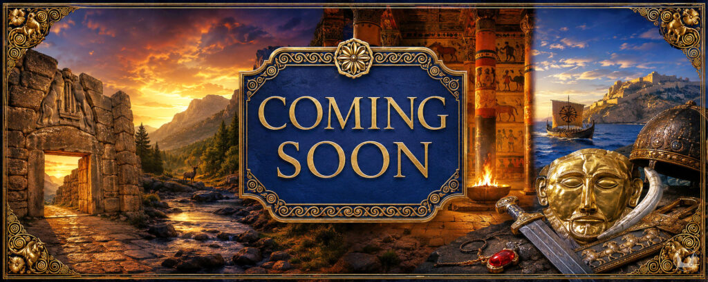
Asterios and the Labyrinth reaches back to the Minoan Late Bronze Age, a world before the alphabet, before Rome, before the civilizations we usually mean when we invoke antiquity. Its design needed to feel ancient and somewhat archaeological: warm, organic, carrying the weight of lost things.
 A Tale of Paris & Paris: Echoes of Troy is set in Renaissance Cortona of 1450, a world of stone piazzas, convent cloisters, civic intrigue, and private devotion. Its visual register required the gravity of the Quattrocento, the same period that produced the printing revolution Morris studied and revered. The decorated title page, the archaic orthography of the copyright notice, the chapter ornaments, all of them place the reader in Lorenzo di Ranieri’s Cortona before the first line of prose.
Atalanta of the Wild carries a triple temporal layering—Bronze Age event, Renaissance narration, contemporary reading—and its design had to honor all three without collapsing into any one of them. The chrysalis device on the prologue page, aligned with the illustration of the Lion Gate of Mycenae above it; the use of EB Garamond and Cormorant Garamond in deliberate tension; the Cloister Initials drop caps that begin each chapter as though a medieval illuminator had touched the page: these are not decorations. They are arguments about what kind of book this is and what kind of reading it demands.
William Morris was right. The book is the art. Every page I set, every cover I design, every typeface I choose is my agreement with him and my promise to the reader that what they hold in their hands was made with care.

Rio de Janeiro, the xxviii day of May, MMXXVI
Asterios and the Labyrinth, A Tale of Paris & Paris: Echoes of Troy, and Atalanta of the Wild are available now. Each is typeset, designed, and published entirely by the author.